A new print with my tireless companion, the Walking Man

A new print with my tireless companion, the Walking Man
This summer I did a lot of experiments with mounting transferprints on panels and sealing them with with every varnish, glaze and UV protectant ever invented. And in the end, wondering why I was trying to make paper be something other than what it is, I’ve gone back to tradition: the print floating in a pristine field of luscious, deckled rag white.
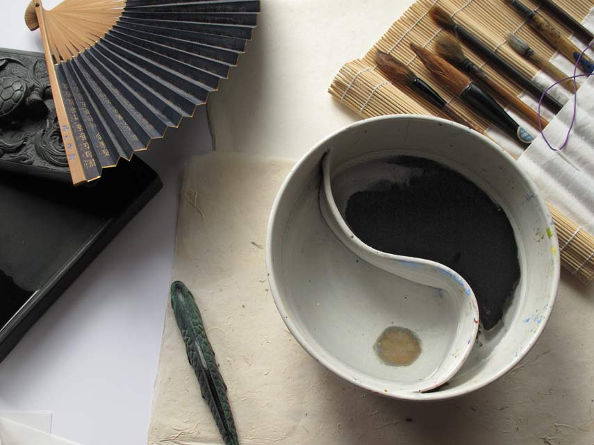
I realize why I had avoided it. It’s ridiculously difficult! The Arches is soaking wet with gel alcohol, the plate is flimsy and wants to buckle, and it is ready to deliver ink the second it touches down. You can’t hinge the plate to the paper because usually it is smaller than the paper, and tape will tear the surface anyway. I recalled from my other life as a calligrapher that one cannot do the character for Mujo perfectly without doing several thousand imperfect ones and throwing them away. And one can’t load the brush without ink, which must be ground, and then one must meticulously prepare the workspace with felt and weights so the fragile ricepaper does not fly away. All this preparation may take an hour. And without it, torn and blotted paper, ink that dries to pale whispers, and a profound sense of being out-of-groove.
Printmaking groove requires the same precision and attention. Several years ago I visited Stephen Hazel at his Studio Blu, and the laboratory glare of perfection made me gasp. I don’t think there was dust anywhere in his zipcode. Thank you Stephen, for reminding me of the importance of order. Process = product.
To deal with the problem of the plates being smaller than the paper I bought large sheets of frosted mylar, which I hinged to my drafting table (which I covered with large sheet of plex.) I then drew various grids on the frosted side so I could position the plates, face up, to flop into correct position with even borders. I made an egregious technical error on one set-up, which was to place the plate on the frosted side, so the frosted mylar came into contact with the gel alcohol. The finish comes off over time and leaves a strange matte residue on the paper.
Hinging solves a lot of problems but not all. The deckle of a full sheet allows for some out-of-square possibilites, and I have to be very careful about how the paper lines up along the edge of the carrier sheet. The only tape I found that could reliably hold the hinge without going out of square after awhile was blue painter’s tape. Masking tape peels off the plexiglass and acetate too easily. And then…there is dirt. Hairs from the brush. Eyelashes, flywings, whatever can fall on that damp border of white paper will. I believe this is why the word “edition” means “pain” in certain languages, just as “danger” is supposed to equal “opportunity” at least according to those t-shirts at duty-free shops in Tokyo. Below, a finished print on the left, lined up to register with hinged plate on mylar on the right. *This was a quick photo and the finished print is placed upside down. It should mirror the plate.

Here is the first print done this way, not perfectly even borders, but getting close:

© Iskra Johnson, “Ode to StudioBlu”
This autumn I began practicing with a zen group new to me, the Blue Heron Zendo. I have been sitting in the Vipassana tradition for many years, but my roots are in zen. The black cushion, the tatami mats, the kosaku, the grinding of ink into the wee hours to fill baskets with rice paper covered in the Heart Sutra, I had left this but it had not left me. And so I found myself one Tuesday night at the top of a three story house in a formal temple dumbstruck by the most beautiful bell I have ever heard. Followed by bowing and chanting and inwardly objecting to chanting (which I long ago took a position against, after all I want to talk and with chanting you can hardly get a word in edgewise.) Two hours of walking, chanting, staring at the wall.
Clear mind, clear mind, don’t know.
The heart sutra’s bleak-but-not refrains of no-thing-ness, and images involuntary offering the balm of metaphor. Blessed metaphor: where is the sutra to you/for you? — or must I look to the German sangha, to Rilke and the tormeted but ecstatic Europeans for that? “A Metaphor is a dangerous thing. A single metaphor can give birth to love.”*
This practice changes you.

* Milan Kundera, a Czechoslovakian zen master of literature.
The Artist Trust EDGE program was an extraordinary week. Fifteen dedicated artists of diverse mediums, and a roster of fine business coaches, curators and time management gurus together at Fort Worden in Port Townsend. We had spectacular weather. I will be processing this experience for many months to come, but here are a few photographs I took during the week that give you a sense of the place. I have enough material for a year of prints.

I’ll admit working on an “artist statement” intermittently and obsessively for seven days at first seemed like an exercise in self absorbtion and folly. Especially as I had no computer and wrote the thing by hand — how I missed playing the piano of the keyboard! But on the last morning as I set out to shoot, everything suddenly came together and made sense. I feel like I really know why I am doing what I am doing as an artist, perhaps for the first time.


I have a friend who can fix or make anything, including building a house or a motorcycle from "scratch" as Betty Crocker might say. As an added bonus he has an indelible instinct for good taste versus cheeziness and he really knows art. Yesterday he came over to help me figure out something about paper. Paper has been keeping me up at night. What is its nature? When will it return? Why did it go out of vogue? Should you glue it to a board and turn it into decoupage? Should you frame it behind glass? What about the apparently thousands of people who gallerists now claim "don't want glass in their house?" These people live where the sun shines, and with global warming, excuse me, climate change, this could end up being ninety-nine percent of the people in the world except for those under three feet of water. These people, these sunshine people, have requested oil paintings or things that look like oil paintings, on canvas or panel.
Paper is delicate, and paper is not forever. It doesn't like raking southern light. It doesn't like bugs, or humidity or dents from the vacuum cleaner handle. This is why picture framing was invented. "Think about those French chickens under glass," my friend said, "what was that dish called? It arrived under a dome and you knew it was special, and valuable." "And it had no flies," I added. We proceeded to line up every kind of hinging tape ever invented and figure out the best way for a person with absolutely zero crafting ability (myself) to attach a piece of paper to a piece of mattboard so it is straight and doesn't fall off.
With that figured out I went downtown to look at some Art on Paper. "Over and Over: A Small Survey of Obsessive Drawing" is currently showing at Vermillion through October 8. Notably, several of the artists left the frame off completely and tacked the paper to the wall, bypassing presentation anguish but perhaps substituting that of the errant wine glass, lipstick kisses or studded jacket on opening night. I was particularly taken with the work of Patrick Kelly. His "Carbon Traces" are nearly sculptural, with dense and pressurized strokes of graphite forming refractive swirls that appear dimension and metallic, and they benefit hugely from being seen without glass. I found myself mesmerized by the surface ambiguity and lyrical patterning of Amanda Manitach's pencil drawings. They take me to a parlour on a gray day; the air is soft, perhaps rain has just fallen, and innocuous but scandalous poetry is being read offstage. Perusing Manitach's website I can see that here is a mind thinking in limitless media and layers of investigation. I want to keep up with this intriguing artist and see what she'll do next.
In Pioneer Square I visited G. Gibson. Here, in Justin Gibbens' astonishing ink drawings I found my chicken under glass, but with insects included. I am a true Arachnophobe, and so it is good that I didn't allow myself to identify what I saw until just now, reviewing his work online. I got lost in the beauty of his meticulous draftsmanship, which is a rare blend of scientific illustration and Chinese painting. You will see wolves here, and falcons, and pelicans, but everything is not quite right. You will have to go yourself to see what it is I'm not telling you. I was so convinced it was "real" (as in an expedition notebook documenting the species of the New World), that I didn't realize until I came home that it can't be. His framing is brilliant, and the match between the specimen-box simplicity of some, the Victorian filigree of others, and the drawings themselves is striking and original.
I came home inspired and breathing happy: paper is back.